


Excel Template: Financial & Business Analytics tool
- Admin

- Sep 11
- 3 min read
Managing business performance doesn’t always require complex BI tools. With the right Excel setup, you can track sales, purchases, costs, and margins in a clean, interactive way. This Financial & Business Analytics template is designed for small to medium businesses who want a ready-to-use reporting system.
In this post, I’ll walk you through the workbook page by page, explain how calculations work, and show how to interpret the dashboards. At the end, you’ll find a practical user guide you can share with colleagues.

Workbook Overview
The workbook contains several connected sheets:
Sheet | Purpose |
Data | Transaction log (sales & purchases). |
Catalog | Product master (codes, prices, brands, categories). |
Processing | Calculation layer (aggregations, KPIs, helper fields). |
Control | Pivot-like summary for quick lookups. |
YEARS / MONTHS | Interactive dashboards. |
Background | Baseline yearly totals. |
Top5 | Helpers for top-N visuals (categories, brands, products). |
Named ranges like Year, Month, Category, Brand, Product, and Code feed slicers across dashboards.
Sheet-by-Sheet Explanation
1. Data (Transaction Fact Table)
Columns: Date, Code, Product, Purchase, Cost, Sold, Price, Brand, Category, Month, Year.
Each row = one transaction.
Rules:
Date must be a valid Excel date.
Month & Year must match the date.
Code must exist in Catalog.
Use Sold & Price for sales; Purchase & Cost for procurement.
This is the main input sheet. Every analysis depends on how clean and consistent this data is.
2. Catalog (Product Master)
Columns: Code, Product, Cost Price, Retail Price, Margin, Brand, Category, Description.
Rules:
One row per product code.
Update regularly to standardize naming and pricing.
If your product list grows, this is where you expand.
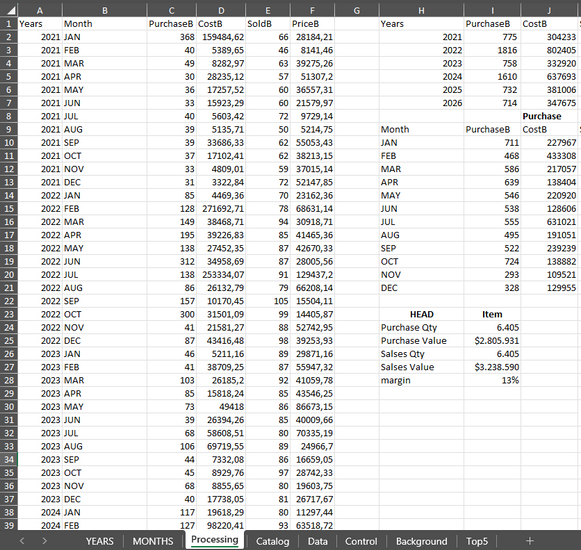
3. Processing (Calculated Layer)
This sheet powers the dashboards. It includes:
Baseline Totals: PurchaseB, CostB, SoldB, PriceB.
Comparisons: Previous year/period totals (Years.1, PriceB.1, etc.).
Cursors: Running totals for cumulative charts.
KPIs:
Perc1–Perc4 → typically Gross Margin %, Conversion %, Average Price changes, or YoY/MoM trends.
Label1–Label4 → show which KPI you’re looking at.
Sorting: Y/M column ensures months sort in order.
Do not overwrite formulas. Extend them when adding new months/years.
4. Control (Pivot Summary)
Acts as a mini-data warehouse inside Excel:
Columns: Name, Sum Purchase, Sum Cost, Sum Sold, Sum Price.
Name combines Year, Month, Category, Brand, Code, Product.
Useful for KPI cards and quick comparisons.
5. YEARS & MONTHS (Dashboards)
The front end of the workbook:
Slicers for Year, Month, Category, Brand, Product, Code.
Visuals include trend lines, cards, and top-N charts.
Example: choose 2024 and Electronics → instantly see gross margin, revenue trend, top 5 products.
6. Background & Top5
Background: Stores baseline yearly totals.
Top5: Provides helper rankings for visuals (Top 5 Products, Top 5 Brands, etc.).
Key KPIs & How to Interpret Them
Gross Profit (€) = Price – Cost
Gross Margin % = (Price – Cost) ÷ Price
Conversion % ≈ Sold ÷ Purchase
Average Selling Price = Price ÷ Sold
Perc1–Perc4 in Processing usually link to these KPIs. Always check the Label columns to confirm which metric is displayed.
How to Maintain & Adjust
Add Products:
Go to Catalog, insert new rows with product details.
Append Transactions:
Add rows in Data. Keep Month/Year aligned with Date.
Add New Periods:
Extend formulas in Processing downwards.
Update named ranges if they are fixed.
Refresh:
Press Ctrl+Alt+F5 (Refresh All).
Dashboards update automatically.
Fix Slicer Issues:
Edit named ranges in Formulas > Name Manager if new items don’t show.


Comments