Mastering Power BI: How to Navigate Components Like a Pro
Power BI is transforming the way we work with data. Whether you're a data analyst, a business intelligence pro, or just someone who loves data, getting the hang of Power BI is key for awesome data visualization and analysis. This guide will help you explore the different parts of Power BI like a total pro. Power BI dev - daily job Understanding the Power BI Interface Familiarize yourself with the user interface to harness Power BI's full potential effectively. Power BI is a powerful business...

Power BI is transforming the way we work with data. Whether you're a data analyst, a business intelligence pro, or just someone who loves data, getting the hang of Power BI is key for awesome data visualization and analysis. This guide will help you explore the different parts of Power BI like a total pro.

Understanding the Power BI Interface
Familiarize yourself with the user interface to harness Power BI's full potential effectively. Power BI is a powerful business analytics tool that consists of several key components, each designed to facilitate different aspects of data analysis and visualization: Power BI Desktop, Power BI Service, and Power BI Mobile. Understanding how these components interconnect and function will significantly enhance your ability to analyze data and make informed decisions.
Many users spend a considerable amount of their time utilizing Power BI Desktop, which serves as the primary application for report creation and data modeling. In this robust desktop application, you can connect to a wide variety of data sources, ranging from traditional databases like SQL Server and Oracle to modern cloud-based solutions such as Microsoft Azure and Google Analytics. This flexibility allows you to aggregate data from different platforms, creating a comprehensive view of your organization’s performance. Furthermore, Power BI Desktop provides a user-friendly interface that simplifies the process of creating visually appealing reports and dashboards. The Home ribbon, a crucial feature of the interface, provides quick access to essential functions, including importing data, transforming data, and managing relationships between different datasets. For example, you can easily pull data from a SQL database, an Excel spreadsheet, or even cloud services like Azure, allowing you to integrate various data streams seamlessly into your reports.
The Power BI Service, on the other hand, is the online platform that facilitates the sharing and collaboration of your reports and dashboards with stakeholders across your organization. After you have created your reports in Power BI Desktop, the next logical step is to publish them to the Power BI Service. This cloud-based service not only allows for broader distribution of your reports but also offers features such as dashboards, where you can pin visualizations from multiple reports for a consolidated view. Moreover, the Power BI Service includes advanced functionalities like setting up row-level security, which is critical for ensuring that sensitive information is only accessible to authorized users. This capability is particularly valuable in organizations where data privacy and compliance are paramount, as it allows for granular control over who can see what data, thereby protecting sensitive information while still enabling data-driven decision-making.
Power BI Mobile enhances the accessibility of your reports and dashboards by allowing you to access them from your smartphone or tablet, providing flexibility and convenience for users who are frequently on the go. With the increasing trend of remote work and mobile access to data, having the ability to view and interact with reports on a mobile device is essential. Studies show that over 78% of business professionals use mobile devices to view reports, making it crucial to create mobile-friendly content. The Power BI Mobile app allows users to receive real-time data alerts, interact with reports through touch, and share insights directly from their devices. This enhances collaboration and ensures that decision-makers have access to the latest data wherever they are, thus fostering a more agile and responsive business environment.
Getting Data into Power BI
The first and most crucial step in any data project is importing your data into Power BI. This powerful business analytics tool enables users to visualize their data and share insights across their organization or embed them in an app or website. This tool supports multiple data sources, providing users with flexibility and versatility. You can import data from traditional sources such as Excel spreadsheets and SQL databases, as well as from cloud-based platforms like Azure, Google Analytics, and even social media channels, which allows for a comprehensive analysis of data from various environments.
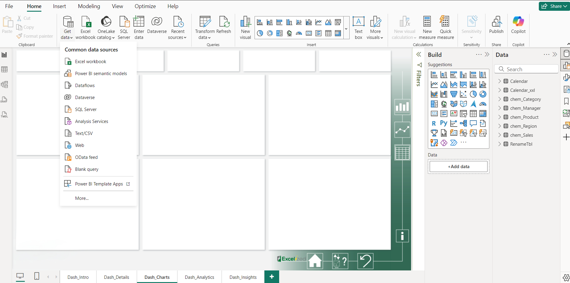
To connect to a data source, start by clicking the "Get Data" button located prominently in Power BI Desktop. This action opens a dialog box that presents you with a wide array of data source options to choose from, including but not limited to files, databases, online services, and other platforms. After selecting your desired source, you will be guided through a series of prompts that may require you to authenticate your credentials, ensuring that your data remains secure. Once authenticated, you can proceed to load your data into the Power BI environment, where it will be prepared for analysis.
It is essential to ensure that your data model is well-structured and organized. A well-organized data model not only simplifies reporting efforts but also significantly improves performance, allowing for faster query responses and more efficient data processing. Once your data is loaded into Power BI, you have the opportunity to apply various transformations in the Query Editor. This powerful feature allows you to perform a wide range of data cleaning and preparation tasks, which are crucial for ensuring the quality and usability of your dataset. Transformations may include changing data types, renaming columns for clarity, or merging tables to create a more cohesive dataset.
For instance, if you are importing sales data from a SQL database, you might want to take several steps to enhance the quality of your data. This could involve removing any unnecessary columns that do not contribute to your analysis, filtering out incomplete records that could skew your results, or aggregating sales data by month to provide clearer insights into trends over time. Additionally, you may want to create calculated columns or measures that provide further analytical capabilities, such as calculating year-over-year sales growth or determining the average sale per transaction. These actions not only streamline your data but also empower you to generate more meaningful reports and visualizations that can drive informed decision-making within your organization.
Transforming Data with Power Query
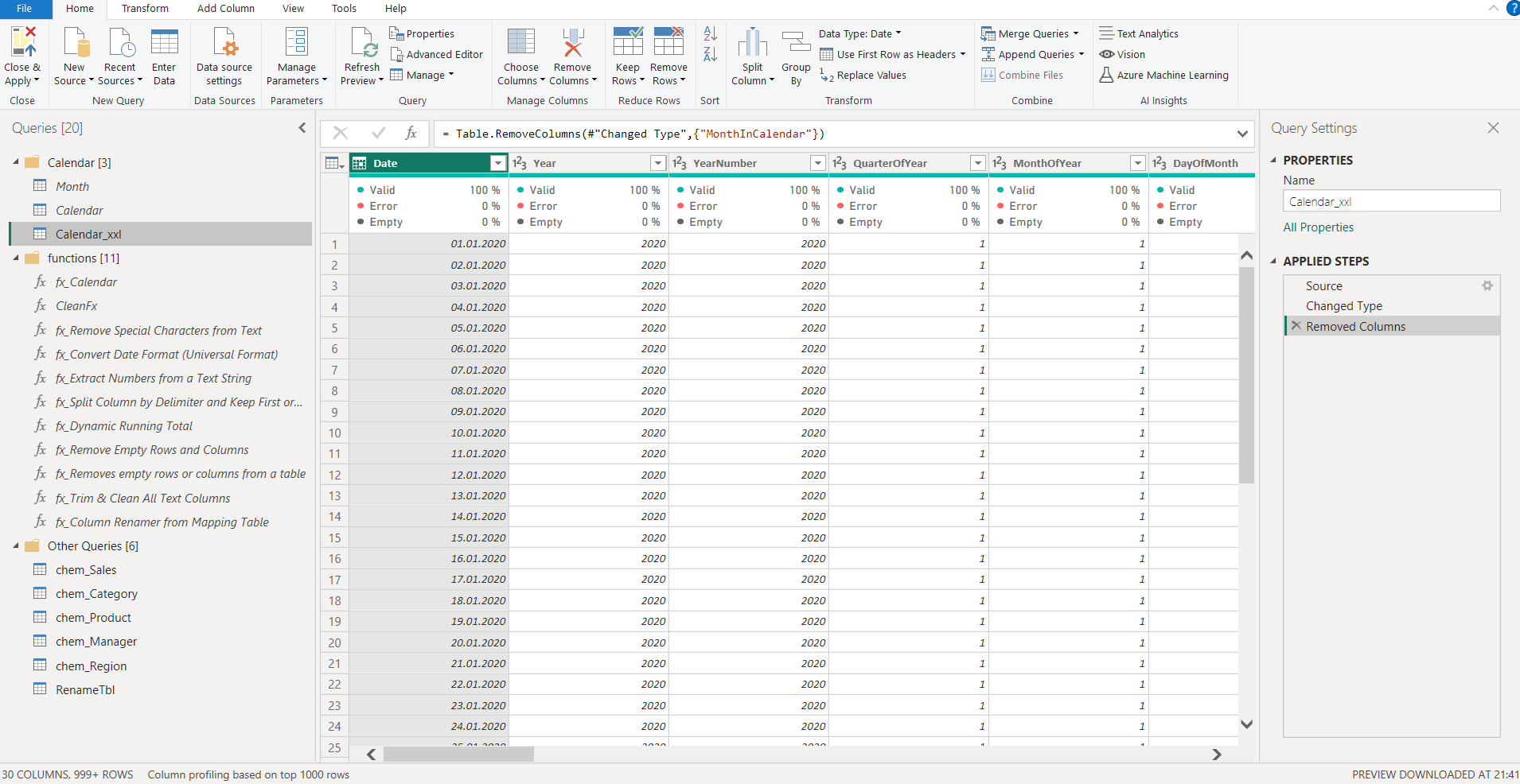
Power Query is a powerful and essential tool integrated within the Power BI ecosystem, playing a pivotal role in preparing data for thorough analysis and insightful reporting. This component enables users to perform a wide range of data preparation tasks, including data cleansing, transformation, and reshaping, through a user-friendly and intuitive interface that caters to both novice and experienced users.
One of the standout features of Power Query is its capability to streamline the data preparation process, which is often a time-consuming and complex task. By utilizing this tool, users can efficiently manipulate their datasets to ensure that the data is not only accurate but also ready for in-depth analysis. The interface allows for a visual representation of the steps taken during data transformation, making it easier to track changes and understand the data flow.
You can use Power Query to:
Remove duplicates from your dataset to ensure accuracy and consistency. This process is vital, especially in scenarios where data is gathered from multiple sources, which can lead to potential redundancy. By eliminating duplicate entries, you can maintain the integrity of your data and ensure that your analyses accurately reflect the actual values without distortion from repeated information.
Change data types to match the requirements of your analysis. Data often comes in various formats that may not be suitable for the intended analysis. Power Query allows you to easily convert data types, such as changing text to numbers or dates, ensuring that your data aligns with the analytical processes and functions you plan to apply.
Merge and append queries for comprehensive insights. This feature enables users to consolidate data from different sources, creating a more holistic view of the information at hand. By merging and appending queries, you can uncover relationships and trends that may not be visible when datasets are analyzed in isolation.
Filter and sort data for better clarity. Power Query provides robust filtering and sorting options, allowing users to focus on specific subsets of data that are most relevant to their analysis. This capability enhances clarity by enabling analysts to drill down into the data, isolating key information and trends that warrant further exploration.
Getting comfortable with Power Query can significantly enhance your reporting efficiency and overall productivity. As you manipulate your data, it is crucial to regularly check the applied steps pane, which serves as a log of all transformations made during the data preparation process. This pane not only allows you to understand the sequence of transformations but also provides the flexibility to adjust or remove specific steps as needed, facilitating a more tailored approach to data management.
For example, if your dataset has overlapping entries for customer purchases, removing those duplicates can prevent skewed results in your final analysis. By ensuring that each customer purchase is counted only once, you can derive more accurate metrics regarding sales performance, customer behavior, and overall business health. This level of precision is vital for making informed decisions based on data insights.
In addition to these functionalities, Power Query also supports advanced data transformation capabilities, such as pivoting and unpivoting data, which can be particularly useful in reshaping data structures for better analysis. Furthermore, its integration with various data sources, including databases, Excel files, and cloud-based services, makes it a versatile tool for data professionals who need to work with diverse datasets. Overall, Power Query not only simplifies the data preparation process but also empowers users to derive meaningful insights from their data more efficiently.
Creating Data Models
After your data is meticulously cleaned and transformed, it’s time to embark on the crucial step of building your data model. A robust and well-structured data model not only enhances performance but also plays a pivotal role in ensuring the accuracy and reliability of your reports. A thoughtfully designed data model serves as the backbone of your analytical efforts, allowing for seamless data retrieval and insightful reporting.
To effectively enhance your model, it is essential to establish meaningful relationships between different tables within your data set. This process begins in the "Model" view, a dedicated workspace where you can visually manipulate and connect tables. Utilizing a simple drag-and-drop interface, you can create relationships that reflect the logical connections between various data entities. For example, if you have a table containing customer information and another with sales transactions, linking these two tables through a shared key, such as Customer ID, will enable you to analyze sales data in the context of customer demographics.
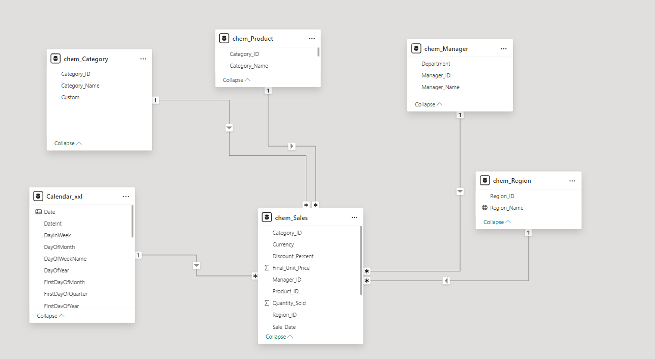
As you create these relationships, it is crucial to pay careful attention to cardinality, which refers to the uniqueness of data values within a particular column. Understanding the cardinality of your data helps you define the nature of the relationships—whether they are one-to-one, one-to-many, or many-to-many. Additionally, filter direction is another crucial concept to consider, as it determines how data flows between related tables. This aspect of the model influences how filters applied to one table affect the data displayed in another, ultimately impacting the insights derived from your reports.
To further enrich your data model, you can leverage DAX (Data Analysis Expressions), a powerful formula language explicitly designed for data modeling and analysis. DAX allows you to create calculated columns and measures that provide deeper insights into your data. For instance, if you want to calculate total sales for each region, DAX can assist you by generating a new measure that automatically sums sales figures from the relevant tables based on the established relationships. This dynamic calculation not only streamlines your reporting process but also ensures that your insights are consistently updated as your underlying data changes.
In addition to basic calculations, DAX provides a wide range of functions that enable complex analyses, including time intelligence calculations, filtering data based on specific criteria, and aggregating data across multiple dimensions. By harnessing the full potential of DAX, you can transform your data model into a powerful analytical tool that provides comprehensive insights tailored to your business needs.
Designing Compelling Reports
With your data model firmly established, it's time to embark on the exciting journey of creating stunning reports that will not only convey information but also engage your audience. The report canvas serves as a dynamic workspace that offers a plethora of visualization options, ranging from simple bar charts that effectively represent categorical data to complex scatter plots that can uncover relationships between variables. This flexibility enables you to select the most suitable visual representation for the data at hand, ensuring that your reports are both informative and visually appealing.
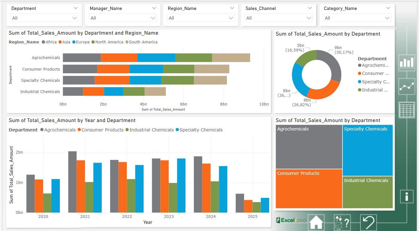
To add visualizations to your report, drag a field from your data model onto the report canvas. This intuitive action initiates the process of transforming raw data into insightful visuals. Additionally, the Visualizations pane provides an extensive array of charts and graphs, each of which can be customized to suit your specific needs. You can adjust colors, labels, and styles, ensuring that every element of your visualizations aligns with your brand identity and enhances comprehension. Moreover, the interactivity features allow users to engage with the data in a meaningful way, making the reports not just static displays, but interactive experiences that invite exploration.
As you begin crafting your report, it is essential to develop a straightforward narrative that weaves together your visuals. Consider the overarching story you wish to tell with your data. Each visualization should serve a distinct purpose, contributing meaningfully to the overall message you aim to communicate. Think of your report as a journey for the viewer, guiding them through the data with clarity and intention. The sequence of your visuals should build upon one another, leading to insights that are both compelling and easy to understand. This narrative approach not only enhances the viewer's engagement but also ensures that the key takeaways are memorable.
In addition to crafting a narrative, leveraging filters and slicers is crucial for enhancing the user experience. Filters enable users to focus on specific segments of data, pinpointing the information that is most relevant to their needs. This capability is especially valuable in large datasets where overwhelming amounts of information can obscure critical insights. Slicers, on the other hand, add another layer of interactivity by enabling users to select which data points they want to see highlighted in the visuals. This empowers users to customize their view, making the report more relevant to their queries and analyses. The combination of filters and slicers not only enhances usability but also enables more profound exploration of the data.
According to a comprehensive survey conducted by Microsoft, businesses that incorporate data visualization into their reporting processes experience a remarkable 30% improvement in decision-making speed. This statistic underscores the profound impact that effective report design can have on an organization's ability to respond to challenges and opportunities swiftly. By investing time and effort into creating well-designed reports that leverage the power of visualizations, organizations can enhance their strategic decision-making capabilities and ultimately drive better business outcomes.
Sharing and Collaborating on Reports
After developing your reports, the next step is sharing them with your stakeholders to ensure that the insights and data visualizations you've created can be utilized effectively. This process begins by publishing your finalized report to the Power BI Service, which is a cloud-based platform designed for sharing and collaborating on data analytics. To publish your report, navigate to Power BI Desktop and click on the "Publish" button. This action will prompt you to select the appropriate workspace within the Power BI Service where your report will be stored. It is important to choose the right workspace, as this will determine who has access to the report and how it can be utilized within your organization.
Once your report is published, you can share it with your intended audience by granting access directly in the Power BI Service. This can be done by navigating to the report settings and selecting the individuals or groups you wish to share it with. You can also adjust permissions to control whether recipients can view, edit, or share the report further. Additionally, you have the option to create dashboards that compile key metrics and visuals from multiple reports into a single, cohesive view. This allows stakeholders to gain high-level overviews quickly, making it easier to monitor performance indicators and make informed decisions based on the aggregated data.
Collaboration is a fundamental aspect of working with Power BI, and it is greatly facilitated through the use of workspaces. By creating dedicated workspaces for your team, you can provide a centralized location for brainstorming, editing, and enhancing dashboards together. Each workspace can be tailored to specific projects or teams, allowing for organized collaboration. This feature not only supports collaborative efforts but also facilitates the integration of various perspectives into report development, as team members can contribute their insights and expertise in real-time. Furthermore, workspaces enable version control, ensuring that all collaborators are working with the most current data and visualizations, thereby enhancing the overall quality and effectiveness of the reports produced.
Leveraging Power BI Mobile
Power BI Mobile ensures that your reports are accessible anywhere, at any time. With the mobile app, you can view your dashboards and reports on the go, ensuring you stay updated on the latest insights.
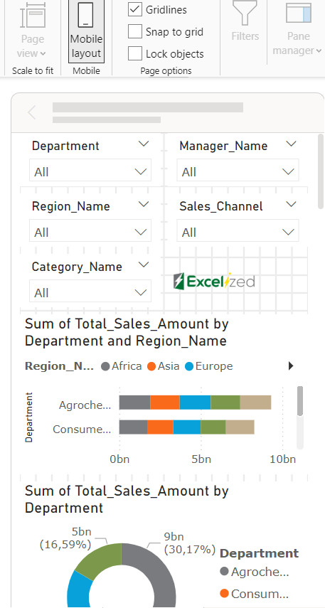
When designing reports, ensure they are optimised for mobile use. You can create specific views optimized for mobile devices directly within Power BI Desktop.
Utilise Power BI Mobile's navigation features, including bookmarks and lists, to enhance the user experience, allowing users to locate essential information quickly. As of 2023, approximately 67% of Power BI users report higher productivity when they engage with data on mobile devices.
Navigating Your Power BI Journey
Mastering Power BI is a valuable skill that can propel insights and data-driven decisions across diverse fields. By understanding the interface, managing data efficiently, and sharing reports with confidence, you can navigate Power BI's components like a seasoned expert.
Continue to explore Power BI's capabilities. Attend webinars, participate in online communities, and practice regularly to refine your skills. Power BI is more than just a tool; it’s a gateway to transforming how you visualize and interact with data. Happy analyzing!