Power BI Service: All Inclusive
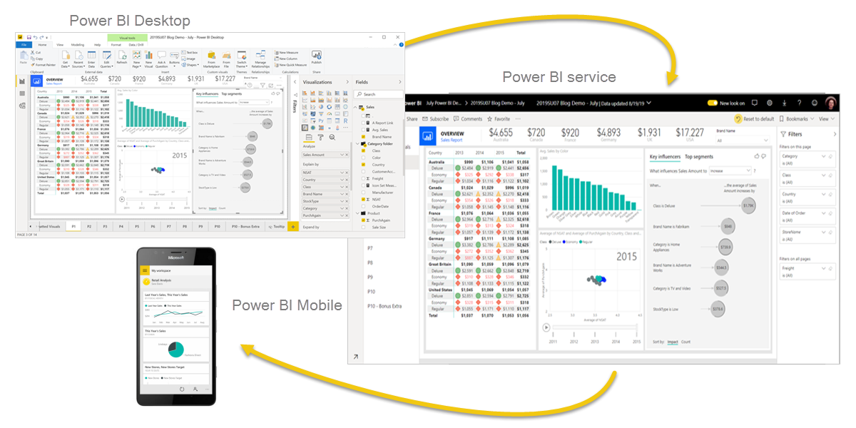
Power BI Service is Microsoft’s cloud-based platform for sharing, collaborating on, and interacting with data and reports. Think of it as the online companion to Power BI Desktop. While Power BI Desktop (a free Windows app) is where analysts build data models and design reports, the Power BI Service ( app.powerbi.com ) is where you share and consume those reports, dashboards, and apps with others. In practice, you’d do your data cleanup, modelling, and report design in Desktop, then...

Power BI Service is Microsoft’s cloud-based platform for sharing, collaborating on, and interacting with data and reports. Think of it as the online companion to Power BI Desktop. While Power BI Desktop (a free Windows app) is where analysts build data models and design reports, the Power BI Service (app.powerbi.com) is where you share and consume those reports, dashboards, and apps with others. In practice, you’d do your data cleanup, modelling, and report design in Desktop, then publish that content to the Service. The Service lets you view reports and dashboards in a browser or mobile app, set up automatic data refreshes, manage access/security, and package content into apps. In short, the Desktop is for creation and editing; the Service is for distribution, collaboration, and consumption (with end users).
Check out some of our FREE templates and materials.
Power BI Desktop: Free install-on-your-PC app. It’s a complete data modelling and report design tool. You connect to data sources, transform data, build a semantic model, and create interactive report pages. Once ready, you publish reports to the Power BI Service so others can use them. You can download Power BI for free:
https://www.microsoft.com/en-us/power-platform/products/power-bi/desktop?WT.mc_id=Blog_Desktop_Update Monthly Power BI updates and information: https://powerbi.microsoft.com/en-us/blog/
Power BI Service: Cloud-based (SaaS). It’s where you and your team share, edit (in limited ways), and consume reports, dashboards, and apps. You can also do light data prep and build basic reports directly in the Service, but most of the heavy lifting happens on the Desktop. The Service is also where you configure collaboration (workspaces), security (permissions, row-level filters), and deliver packaged content (apps) to end users.
Understanding these differences helps avoid confusion when using Desktop to create or update a data model or report. If you need to publish, share, or interact with content in the cloud, that’s the Power BI Service’s job.
Core Concepts: Workspaces, Datasets, Reports, Dashboards and Apps
Power BI Service content is organised into a few key pieces. Think of each piece as a different brick in the BI building:
Workspace: A workspace is like a collaborative folder or project area. Designers/developers use workspaces to store and manage related content (datasets, reports, dashboards, etc.). Each workspace has members with roles (Admin, Member, Contributor, Viewer) that control what they can do. Every workspace lives on your Power BI tenant (app.powerbi.com), and workspaces can be created for departments, projects, or any team.
Dataset (Semantic Model): This is the data model powering your reports. It combines data from one or more sources into tables and relationships. In Power BI lingo, “dataset” often now means “semantic model.” It’s where you define tables, relationships, measures, and filters. For example, you might import sales and employee data and relate them by Employee ID. The semantic model is the foundation that reports and dashboards use.
Report: A report is one or more pages of visuals (charts, tables, etc.) built on a single dataset. Reports are interactive; users can click filters or slicers and drill into visuals. Each report can have multiple pages (tabs). Reports are authored in Power BI Desktop and then published to the Service, or even created/edited in the Service itself if you have dataflows or simple datasets.
Dashboard: A dashboard is a single-page, pin-board style canvas of visual tiles. You (or other report designers) pin visuals (charts, maps, KPIs) from reports to a dashboard to present key metrics at a glance. Executives or managers often use dashboards as “one-stop shops” for monitoring metrics. Unlike reports, dashboards are one-page only and usually contain a mix of visuals from different reports and datasets. Clicking a tile usually takes you into the underlying report for more detail.
App: An app in Power BI packages dashboards, reports, and datasets for distribution to end users. You create an app from a workspace, choose which content to include, and publish it. Users install (or get emailed a link to) the app and see only the approved content. Apps can target specific groups (audiences) so that different teams see different content in the same app. Apps make it easier to share collections of reports with many people at once => RLS dependent!!!
Visualizing Relationships: The components relate as follows: Datasets (semantic models) supply data to reports. Reports provide visuals that you can pin to dashboards. You group related items in a workspace and then package them into apps for distribution.
“A Power BI dashboard is a single page (often called a canvas) that uses visualizations to tell a story. Because it’s limited to one page, a well-designed dashboard contains only the most important elements of that story. The visualizations on the dashboard are called tiles… In most cases, selecting a tile takes you to the report page where the visualization was created”learn.microsoft.com. This highlights that dashboards are about at-a-glance insights; reports are about detailed exploration.
Workspaces and Workspace Roles
Workspaces are the collaborative zones in Power BI Service. Every content (datasets, reports, dashboards) resides in a workspace. You can create multiple workspaces for different purposes (e.g., “BI Team Workspace,” “HR Team Workspace,” “Finance Reports,” “Marketing Analytics,” etc.).
Each workspace has an Access or Members list where you assign people (or Azure AD groups) roles. The leading roles in a workspace are:
Admin: Full control. Admins can add or remove any user, change roles, update workspace settings, publish or delete apps, and do everything Members and Contributors can do. An Admin can also delete the workspace itself.
Member: Can create, edit, and delete content (reports, dashboards, datasets) in the workspace. Members can publish or update the workspace’s app. They can share items and add Contributors or Viewers.
Contributor: Can create, edit, and delete reports and dashboards in the workspace, as well as schedule data refresh. However, Contributors cannot publish the workspace’s app or add new users. If an Admin grants permission, Contributors can update the existing app but cannot set app permissions or create a new one.
Viewer: Read-only. Viewers can see and interact with the workspace content (open dashboards and reports, use filters) but cannot make changes or share content. They cannot edit any content.
A helpful way to remember this is: Admin > Member > Contributor > Viewer in descending order of privileges. All except Viewer can edit and manage content, but only Admins and Members can manage app publishing and user roles.

You assign roles by going to the workspace in Power BI Service, clicking the gear or Access icon, and adding users or groups with the desired role. Remember that even if someone is a Member or contributor in the workspace, Row-Level Security (RLS) still applies to them if they view reports or dashboards (more on RLS below). Also, workspace roles (except Viewer) require users to have Pro/PPU licenses.
Key permissions differences:
Workspace Admins can do everything (add/remove users, delete workspace, publish apps).
Members can do almost everything except delete the workspace or change roles above their level.
Contributors can build and change content, but cannot change app settings or workspace members.
Viewers consume content.
This structure ensures safe collaboration: Designers (Members/Contributors) build and refine reports, while business users (Viewers) can only view the final content.
Row-Level Security (RLS): Keeping Data Tight
Security and access control are critical in any BI solution. One of the main tools in Power BI is Row-Level Security (RLS), which restricts data visibility at the row (record) level based on the user. Think of RLS as putting a filter on the data model that says, “User X can only see rows where Department = X’s department” or “only see transactions in my region.” RLS is defined in the data model (Desktop) and enforced in the Service when users view reports or dashboards.
Row-Level Security is essential in scenarios like:
Regional filtering: Sales managers should only see data for their region. If John is the West region manager, RLS ensures John’s reports show West data only.
Department-based filtering: Each department’s manager sees only their department’s metrics. For instance, HR only sees HR data.
Any “as-managed” view: Any case where sensitive data should be hidden from unauthorised eyes.
Power BI supports two RLS styles:
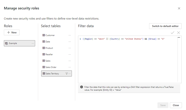
Static RLS: You create fixed roles in Power BI Desktop and define filters (like Department = “Sales”). Then, in the Service, you assign specific users (or groups) to each role. For example, a “Sales” role that filters Department = Sales. You then add Alice to the Sales role, Bob to the Marketing role, etc. This is straightforward but unwieldy if you have many users/roles. Example of Statis RLS below:
[SalesPerson] = "Alice"Dynamic RLS: Instead of hard-coding filters, you use DAX functions like USERNAME() or USERPRINCIPALNAME() along with a mapping table. For example, your data model might include a table of users and their department. You create one “Employees” table with columns Username and Department, relate it to the main data table, and then set a filter like [Username] = USERPRINCIPALNAME(). That way, when Alice opens the report, USERPRINCIPALNAME() returns her email, and the filter automatically restricts data to her department rows. This scales to many users without making separate roles for each. Example of Dynamic RLS below:
[Employees] IN CALCULATETABLE( VALUES(UserAccess[Department]), Employees[Username] = USERPRINCIPALNAME() )RLS is defined in Power BI Desktop under Modelling> Manage Roles, whether static or dynamic. You create one or more roles, pick a table, and determine a filter (either through a drop-down or with a DAX expression). For example, a simple static role might say FactTable[Region] = "West." A dynamic example might be [SalesRep] = USERPRINCIPALNAME().
After defining roles, you publish the report (and its dataset) to the Service. Then, in the workspace, you go to the Dataset’s security settings and add users/groups to each role (for static RLS). For dynamic RLS, the DAX logic filters. However, you still need to assign everyone who should be filtered (typically add broad groups or “All Employees” to that dynamic role, since the filtering logic limits data).
Essential nuances: RLS only applies when consuming content with a Viewer role (or through apps). Admins, Members, or Contributors in the workspace bypass RLS by default (they can see all data). So if you’re testing RLS, view the report as a “test user” with Viewer access to simulate the correct experience.
Dynamic RLS with DAX
For a large or changing user base, dynamic RLS is powerful. The idea is to keep a user mapping table in your model. For example, a SalesReps table has columns such as Username (user’s login/UPN) and Region. Relate SalesReps[Region] to your primary data’s Region, and then define a role with DAX:
SalesReps[Username] = USERPRINCIPALNAME()When Alice (alice@company.com) views the report, USERPRINCIPALNAME() returns her email. The filter finds her row in SalesReps, and she only sees her region’s data. No separate role is needed for each person.
Dynamic RLS steps:
Add a mapping table, e.g., a two-column table (User, Dept). This can be entered manually or automatically from your HR system.
Establish relationships: Link that table to your fact table via the department/region key.
Create one role in Desktop: Under Manage Roles, use the DAX editor to write something like: [EmployeeName] = USERPRINCIPALNAME(). (Note: In Desktop, USERNAME() looks like Domain\username; in the Service it’s UPN, so prefer USERPRINCIPALNAME() for consistency.)
Publish and assign users: Go to the dataset’s Security settings in the Service. Add all relevant users to this one role. Because the DAX does the real filtering, you might assign a broad group (like “All Company”) to that role.
For example, the blog by RADACAD shows a scenario where a Sales Rep table has a User (login) column, and each transaction has a Sales Rep.. The RLS role in Desktop was [User] = USERPRINCIPALNAME(), meaning each person only sees their transactions. Similarly, you could filter by Region by looking up the user’s region in a related table.
datasturdy.com In practice, large organisations often use RLS for departmental or regional filters: e.g., “restrict access so that users in a specific department or region only see relevant data. For example, the Sales department accesses only sales data; Marketing accesses marketing data, and regional managers see only their region’s data.”
Examples of RLS Scenarios
Sales Regions: You have a table of sales by region. RLS ensures the North America sales manager only sees North America rows. You could do static roles (North America, Europe, Asia) or dynamic via a table of user-to-region assignments.
Office Locations: Company HR data, where each manager should see only employees in the office. The RLS filter might be Employee[Office] = LOOKUPVALUE(Managers[Office], Managers[Username], USERPRINCIPALNAME()).
Direct Reports: In hierarchical situations, you may give a manager access to all their team’s data. You could implement this with a “Manager vs Employee” table and a DAX like Employee[Manager] = USERPRINCIPALNAME() OR Employee[Username] = USERPRINCIPALNAME().
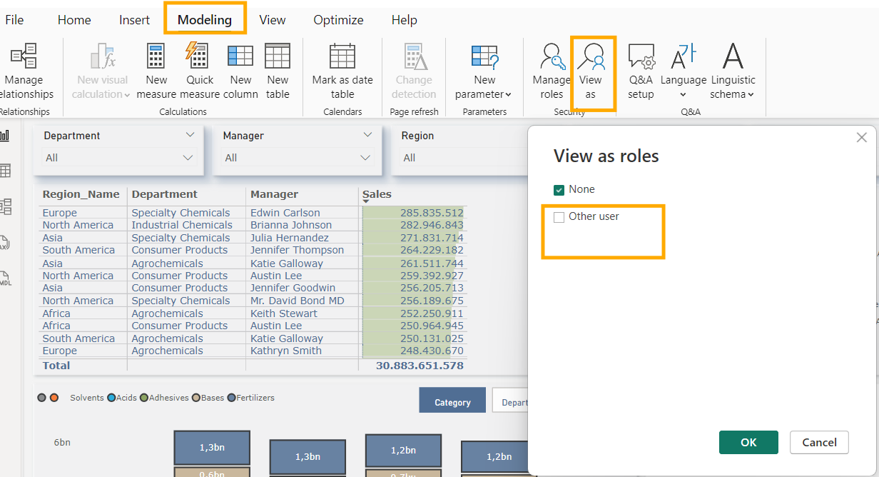
Best Practice: Test RLS using the “View as Role” feature on the desktop or the “Test as Role” feature on the service to simulate different users. Always keep your mapping tables up-to-date with user info. Remember, RLS filters only restrict viewers. Designers (with edit rights) bypass it.
Dashboards vs Reports: What’s the Difference?
It’s easy to confuse dashboards and reports if you’re new to Power BI. Both look similar, but they serve different purposes:
Reports are the design-time, interactive, multi-page documents. A report might have five pages: “Overview”, “Sales by Region”, “Inventory”, etc. You create reports in Power BI Desktop (or edit in Service) by arranging visuals on pages and adding filters or slicers. End users can click around, drill down, and apply filters in a report.
Dashboards are one-page collections of pinned visuals. Imagine a report writer pins a critical KPI or chart to a dashboard. A well-crafted dashboard might show key sales, profit, trends, and so on on one page. It gives a “launchpad” view of the most critical metrics. Dashboards can gather visuals from different reports and datasets. Dashboards are often seen by executives who don’t need to browse pages; they want to monitor top numbers.
A handy analogy: reports are like detailed spreadsheets or slide decks; dashboards are like a one-page summary or an app's home screen. In the Service, clicking the Home icon or Dashboards menu shows you a list of dashboards you can access, while Reports shows reports.
Key points:
A dashboard is always one page. You can’t scroll pages on a dashboard, only within its visuals.
A dashboard contains tiles that link back to the reports. Clicking a tile brings you into the report (or a web link).
You can set alerts on dashboard tiles (e.g., “Email me if Sales go above $100k”), but you cannot do this in reports.
Dashboards can combine data from multiple sources. Reports stick to one dataset per page.
You often design a report first, then pin the important visuals to a dashboard.
Creating and Managing Power BI Apps
Power BI Apps are the modern way to package and distribute content to end users. Think of an app as a neatly organised bundle of reports, dashboards, and datasets you share with a team or the whole company. Apps make it easy to push updates and control who sees what.
Why use apps? Apps are ideal for sharing finished content with business users who shouldn’t mess with the workspace. Instead of giving everyone workspace access, you provide them with an app. Users can find published apps in the Power BI Service (Apps menu or store), or they can email them a link. Apps can also be installed automatically via admin settings.
Creating an app: Only Workspace Admins and Members can create or update an app. The process generally is:
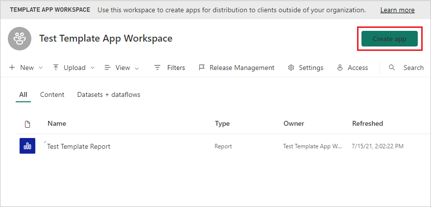
Select a workspace where your polished content lives. (You usually finalize reports here).
In the workspace, click “Publish app” (or “Update app” if one exists).
In the app setup screen, you’ll have steps like:
Setup: Name the app, describe it, and add a logo (optional). Choose who should have access (everyone in the organisation or specific users/groups).
Navigation: (If multiple pages in reports or dashboards, you can arrange the nav pane).
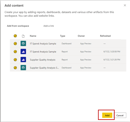
Content: Select which items from the workspace to include. If you want advanced users to build their reports, you can include dashboards, reports, and the underlying datasets.
Audience: The new App experience lets you configure multiple audiences (more on this below).
Review and publish. The app URL and install instructions can then be shared.
Once published, app users see a friendly interface instead of the raw workspace. They cannot edit anything in the app; they can only interact with the reports (filters, cross-filter, drillthrough, etc.).
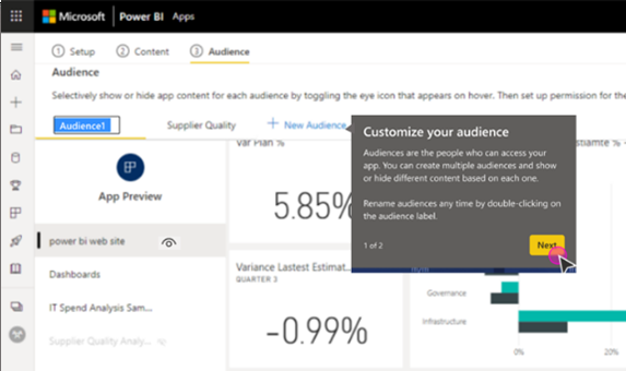
Multiple Audiences: Tailoring Apps to Teams
One of the coolest features of Power BI Apps is the multiple audiences feature. This means the same app can show different content for different user groups. For instance, Sales and Marketing might use the same app, but you can hide sensitive marketing data from the Sales team by audience.
Here’s how it works:
In the App creation flow, there’s an Audience tab. All included content is visible to everyone who can access the app by default. But you can click “New Audience” to define a subgroup.
Each audience is just a label (e.g., “Sales Team”, “Finance Managers”). Under each audience, you use an eye icon to hide or show specific dashboards, reports, or even pages for that group.
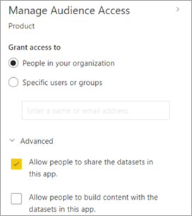
After selecting content per audience, you go to Manage audience access and pick which users or Azure AD groups belong to each audience. You can set an audience to “Entire organisation” (everyone) or narrow it to specific users.
There are also advanced switches per audience, like “Allow people to share datasets in this app” or “Allow build content” (which lets advanced users create their reports based on included datasets).
Practical example: You have an app with a set of financial reports. You create Audience A for “Executives” who see everything (income statement, balance sheet, expenses) and Audience B for “Dept Managers” who only see the metrics relevant to their department. In the Audience tab, you hide detailed drill-through reports from Audience B and only share high-level dashboards.
Important gotchas:
Hidden content is still accessible if you give direct links (unless you uncheck “Allow access to hidden content”). In other words, “hide” removes it from the menu and nav pane, but a savvy user could still open a report by URL. Use security (roles) if truly sensitive or keep it out of the app entirely.
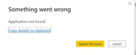
Dashboards with hidden reports: If a dashboard tile points to a report you hide from an audience, that tile will error (“report doesn’t exist or no permission”). Make sure to include and show the report or remove the tile.
Build permissions: Only toggle on “Allow build” if the audience should be able to create their analyses. By default, app consumers only view, not edit.
Configuring multiple audiences takes some planning, but it’s a great way to reuse one app. It ensures users see only what’s intended for them without maintaining separate workspaces or apps.
Step-by-Step: Publishing a Power BI App 🪄
Here’s a quick walkthrough of publishing an app (using the new experience):
Prepare your workspace: Ensure all reports, dashboards, and datasets are tested and up-to-date. Decide which belongs in the app.
Click “Publish app”: In your workspace (top-right corner), click Update app (if existing) or Publish app.
Set up App details: You can optionally give your app a name, description, and logo or theme colour. Decide if it’s available to your entire organisation or only to specific groups. (For example, you can add Azure AD or O365 groups.)
Choose content: On the Content tab, select which Dashboards, Reports, and Datasets will be included in the app. You can also organise the navigation structure here (e.g., a custom menu).
Configure audiences: As discussed, you can create multiple audiences on the Audience tab and hide or show items accordingly. Then click Manage audience access to assign users/groups to each audience.
Review and publish: The builder previews the app’s navigation. Make sure it looks right. Then click Publish (or Update). You’ll get a link you can share.
Users install the app: Business users can search the Apps section in Power BI Service and find your app. It'll appear automatically in some tenants without “Everyone” access. Otherwise, send them the link or email.
Once published, any updates you make in the workspace (e.g., a new report, change data, or fix a bug) won’t appear until you republish the app. Each time, it’s a new version; app users see the updated content without breaking their links or bookmarks.
Troubleshooting & Best Practices 💡
As with any complex system, a few common issues can trip up new Power BI Service users. Here are some tips:
“I can’t see the data- everything is blank!” This usually means RLS or permissions. Check that the user’s account is included in the correct RLS role on the dataset and that they have at least Viewer access to the workspace or app. Remember, workspace Contributors see all data by default.
“Dashboard tile says report doesn’t exist.” If a dashboard tile points to a report not in the app for that audience (or the report is hidden), you get this error. Fix it by including the report in the app and making it visible, or remove the tile.
“I shared the dashboard, but no one got it.” Dashboard sharing in Power BI Service works differently from a file. When you share a dashboard, you must ensure that report owners share underlying dataset access or use apps. It’s often simpler to share an app: add users to the app or audience instead of using the dashboard share.
Licensing hiccups: Some features (like sharing outside your organisation, larger storage, or freeing users from needing Pro) depend on having Premium capacity or the proper Pro licenses. If someone can’t view content, check whether the workspace is premium and if they need a Pro license.
Data refresh fails: A published report may not show new data if the scheduled refresh hasn’t run or the gateway is misconfigured. Check the dataset’s refresh history and gateway status under the workspace’s settings.
App not updating: Remember to “Update app” after changes. It doesn’t auto-refresh for users. Also, clear browser cache or ask users to refresh the app list if they don’t see the new version.
Multiple audiences missing content: Be careful with dependencies. If Audience A sees Report X, but Audience B sees Dashboard Y with tiles from Report X (which is hidden for B), B’s view will break. The app builder warns about this. Always double-check that each audience has the reports behind their dashboards, or use “Allow access to hidden content” if appropriate.
Nested workspaces or cross-workspace data: If your app pulls from datasets in other workspaces, ensure all viewers can access those datasets too. A dataset can only enforce RLS within its workspace context.
Best practice tips:
Keep workspace tidy: Only put polished, approved content in an app workspace. Use separate dev workspaces for rough drafts.
Document roles: Write down who has what workspace role to avoid confusion. Azure AD groups help manage this easily.
Test everything: Use the “View as role” in Desktop and the Audience preview in apps to ensure users see what they should.
Naming and descriptions: Before creating the app, give clear titles to your reports/dashboards. Users see a menu of these names. A bit of explanation text in the app description helps, too.
Monitor usage: In the Service, go to the workspace and check usage metrics to see who’s viewing which report. This can guide app improvements.
By understanding these building blocks—workspaces, roles, RLS, apps, and audiences—you can design a secure, organized, and user-friendly Power BI Service setup. Power BI Service is a powerful hub for turning your analytics into accessible, role-based insights for everyone in the organisation.
Sources: Some concepts and best practices summarised from Microsoft Power BI documentation learn.microsoft.comlearn.microsoft.comlearn.microsoft.com and expert blogs datasturdy.comradacad.com, and hands-on experience with Power BI. Each screenshot shown is from official Power BI interfaces and my test environment.