Building a Power BI Earthquake Monitor (Europe) — From API to KPIs
Goal: a fast, self-updating Power BI report that tracks earthquakes in the European–Mediterranean region (with a global table for comparison), highlights activity hotspots, and surfaces clean KPIs for decision-making. Scope: Earthquakes in the European-Mediterranean region with magnitude 4.5 or greater within the last 720 days or the last 2 years. Source: ETH Zürich - Swiss Seismological Service (HTML daily data): http://www.seismo.ethz.ch/en/earthquakes/europe/last90daysMag4.5plus/ The...

Goal: a fast, self-updating Power BI report that tracks earthquakes in the European–Mediterranean region (with a global table for comparison), highlights activity hotspots, and surfaces clean KPIs for decision-making. Scope: Earthquakes in the European-Mediterranean region with magnitude 4.5 or greater within the last 720 days or the last 2 years.
Source: ETH Zürich - Swiss Seismological Service (HTML daily data): http://www.seismo.ethz.ch/en/earthquakes/europe/last90daysMag4.5plus/
Data Source & Scope
The model pulls data directly from the USGS FDSN Events API as GeoJSON. To keep the dataset lean and relevant, the query is filtered to:
Magnitude: ≥ 4.5
Date window: last N days, controlled by a parameter
Geography (Europe-ish bounding box): minlatitude=24, maxlatitude=72, minlongitude=-35, maxlongitude=45
The API call (simplified):
Power Query (M) Highlights
This is a whole M-code that has been used in this report. Ready for copy-paste into the query editor.
Both fact tables are built in Power Query:
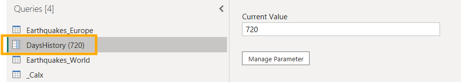
Parameters
DaysHistory — a numeric parameter (default 720). The query computes StartDate = Today() - DaysHistory, EndDate = Today(). You can adjust the parameter days.
Web.Contents & JSON Parse
Download GeoJSON → expand features → expand properties (e.g., mag, time, place, etc.) and geometry.coordinates to get Longitude, Latitude, and Depth (km).
Date & Time Columns
TimeUTC → Date (Date.From(TimeUTC)), Month, Week, HourUTC.
Magnitude Buckets (for legend/color on map)
Logic applied as a text column:
4.5–4.9, 5.0–5.4, 5.5–5.9, 6.0–6.4, 6.5+
Location & Country Parsing
Split place into a clean Location and Country.
For Europe, a simple rule-based mapping turns countries into broader Regions (e.g., Adriatic / Balkans, Aegean / Greece, Caucasus, E. Europe / Caspian, Iberia / W. Med, Iceland, Italy, Mid-Atlantic Ridge, N. Africa, Other).
Day/Night Label
Based on HourUTC:
if 6 ≤ HourUTC < 18 then "Day" else "Night"
Deduplicate & Sort
Remove possible duplicates by a key (usually time + coordinates) and sort descending by TimeUTC so the latest record is easy to read.
The World table* adds a Hemisphere classification for slicing. Everything else mirrors the European logic. *This table is not yet included on the canvas!
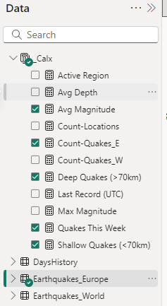
Data Model
Tables:
Earthquakes_Europe (main visuals)
Earthquakes_World (optional comparisons)
_Calx (measures only)
DaysHistory (parameter table)
The model is Import mode for speed. All slicing happens in-memory.
DAX Measures (used in the report)
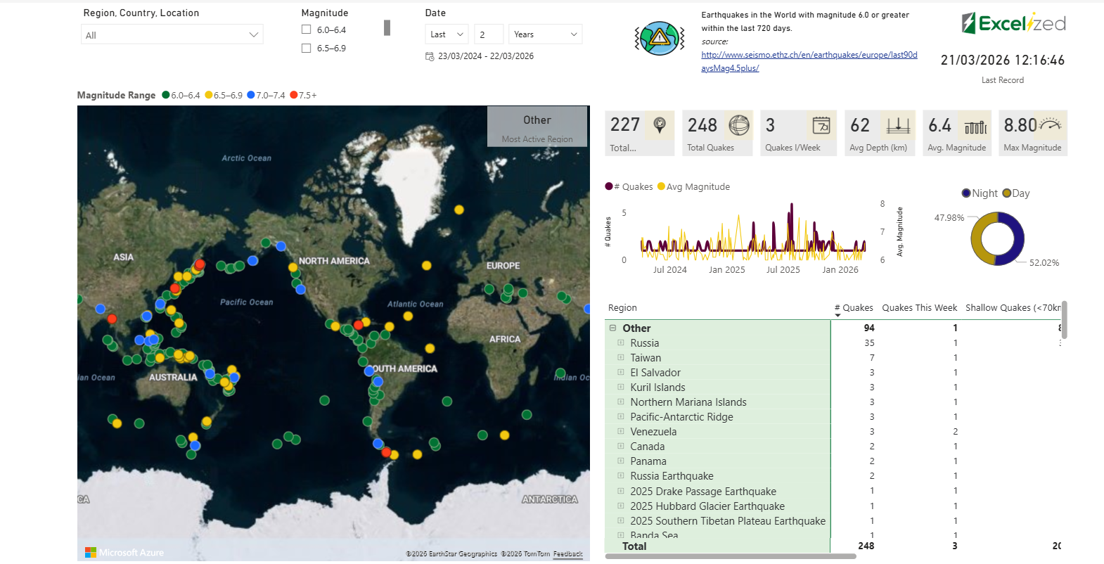
Report Visuals & How to Use Them
1) Interactive Map (Azure Maps)
Bubbles are plotted by Latitude/Longitude from Earthquakes_Europe.
Color comes from MagnitudeBucket (4.5–4.9 in green up to 6.5+).
Size scales with magnitude (or counts when aggregated).
Tooltips show place, magnitude, depth, and time.
Slicers on top:
Region / Country / Location (hierarchical)
Magnitude (bucket selector)
Date range bounded by the DaysHistory parameter
2) KPI Strip (with small icons)
Total Locations → Count-Locations
Total Quakes → Count-Quakes_E
Quakes This Week → Quakes This Week
Avg Depth (km) → Avg Depth
Avg Magnitude → Avg Magnitude
Max Magnitude → Max Magnitude
Last Record (UTC) → Last Record (UTC) (timestamp for data freshness)
Most Active Region → Active Region
These are designed to be screenshot-ready and readable at a glance.
3) Trends & Distribution
Line/Combo chart: Count-Quakes_E (primary axis) and Avg Magnitude (secondary) across time. This makes spikes (many quakes) vs severity (higher average magnitude) easy to compare.
Day vs Night donut: uses the Day/Night column and Count-Quakes_E to visualize temporal patterns.
4) Region → Country → Location Matrix
Rows: Region > Country > Location
Columns (measures): # Quakes, Quakes This Week, Shallow & Deep counts, Avg Magnitude
Useful for drilling into hotspots like Aegean / Greece, Iceland, Mid-Atlantic Ridge, etc.
How I Built It (Step-by-Step)
Design the Scope
Decide on magnitude cutoff (≥4.5) and the geographic frame (Europe bounding box).
Add a flexible DaysHistory parameter (default 720 days) to keep performance snappy.
Connect & Shape in Power Query
Call USGS FDSN API with Web.Contents.
Expand GeoJSON → normalize columns.
Derive all helpful fields (Date parts, MagnitudeBucket, Day/Night, Region).
Deduplicate and sort.
Repeat for the World table (add Hemisphere).
Model & Measures
Keep a clean schema: fact tables + a measures table (_Calx).
Write simple, readable DAX (see above).
Validate results against raw previews (e.g., “Last Record (UTC)” should match the most recent TimeUTC).
Visuals & UX
Map first (most intuitive), KPIs top-right, trend + donut as quick context, matrix for detail.
Use a Magnitude legend that matches the buckets created in Power Query.
Create minimal, consistent icons for the KPI strip.
Performance & Maintenance
The bounding box + magnitude cutoff significantly reduces payload.
DaysHistory lets you widen/narrow history without editing the query.
Refresh on a sensible schedule (e.g., daily). If you need near-real-time, consider incremental refresh with a date key.
If you need a detailed guide for this report, including step-by-step instructions, you can download it below.
Do you need a starter DAX package in every Power BI project? Just with a slight adjustment to the quick and efficient calculations. Check it out.

Power BI Error Handling: Build Reusable Queries That Work on Any Table
Read insight