

Power BI Drillthrough: Hidden Tips, Best Practices & Real-World Use Cases
- Admin

- Jan 10
- 3 min read
Updated: Feb 26
Drillthrough is one of the most underrated Power BI features. Most users know the “right-click → Drill through” part — but few really understand how powerful it becomes when combined with smart page design, DAX context, tooltips, and UX tricks.
In this article, we’ll cover how Drillthrough works, how to build it properly, and hidden tips that even experienced users often miss.
PRACTICE MATERIAL BELOW!👇
What Is Drillthrough in Power BI?
Drillthrough allows users to navigate from a summary visual to a detailed page, while automatically passing filter context (like Product, Customer, or Country).
Typical examples:
From Sales Overview → Product Details
From Country KPI → Customer List
From Exception KPI → Root-cause table
Unlike Drill Down, Drillthrough:
Works across pages
Can pass multiple fields
Keeps slicers & filters intact (if designed correctly)
When to Use Drillthrough (and When Not)
✅ Use Drillthrough when:
You want clean overview pages
Details would clutter the main report
You need transaction-level analysis
You want to teach users analytical navigation
❌ Avoid Drillthrough when:
The detail fits comfortably on one page
Users expect instant inline expansion
Performance is already tight
💡 Rule of thumb: Overview answers “what” — Drillthrough answers “why”.
Step-by-Step: Creating a Proper Drillthrough Page
1️⃣ Create a Dedicated Detail Page
Add a new report page
Rename clearly, e.g.Product Details (Drillthrough)
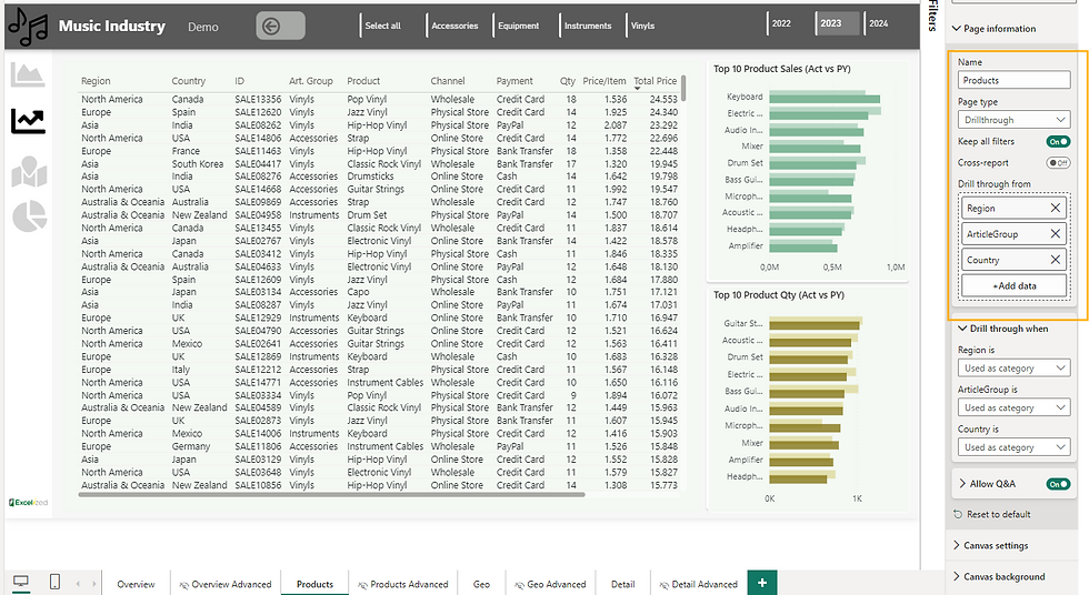
2️⃣ Add Drill through Fields
In the Visualizations → Drillthrough well:
Drag the field(s) you want to pass
Example:
Region
Country
ArticleGroup
⚠️ Tip: You can add multiple fields — they act as AND filters.

3️⃣ Design the Page Like a Detail Report
Recommended visuals:
KPI cards (Sales, Profit, Margin)
Trend line (Date vs Sales)
Transaction table
Breakdown by Channel / Region
💡 Pro UX Tip: Add a large title card using the selected field:
SELECTEDVALUE(Products[ArticleGroup])4️⃣ Enable the Back Button (Manually!)
Power BI does not automatically add a back button.
Steps:
Insert → Button → Back
Enable Action = Back
Place it top-left consistently
Hidden Drillthrough Tips (Advanced but Practical)
🔹 Tip 1: Drillthrough WITHOUT Right-Click
Many users never right-click.
Better UX options:
Buttons with Action → Drillthrough
Icons inside tables
Tooltip instructions (“Click to see details”)
This feels more app-like.
🔹 Tip 2: “Keep All Filters” = Game Changer
Enable Keep all filters on the drillthrough page to:
Preserve slicers
Keep date context
Avoid confusing results
Perfect for:
Time-intelligence analysis
Multi-slicer reports
🔹 Tip 3: Drillthrough Tooltips (Yes, Really)
You can combine:
Tooltip page
Drillthrough page
Workflow:
Hover → quick insight
Click → deep dive
This is next-level UX and great for executive dashboards.
🔹 Tip 4: Teach Drillthrough with a Tooltip Hint
Most users don’t know it exists.
Add a small tooltip text:
Right-click to view detailed analysis
Or use an info icon with instructions.
🔹 Tip 5: Drillthrough + Field Parameters
Advanced pattern:
Change table columns or KPIs on the drillthrough page dynamically
Let users switch between:
Business view
Finance view
Operations view
Perfect for teaching modern Power BI UX patterns.
Bonus trick (at least for me)
By default, " Get more info " is greyed out (button). As soon as you click on fields like region or country (which are included in drill through), this button becomes clickable. It can give you a fancy look and more possibilities to access your data.


Performance Best Practices
✔️ Filter data early✔️ Avoid massive tables unless needed✔️ Use measures instead of calculated columns✔️ Limit visuals per drillthrough page
💡 Remember: Drillthrough pages are often the heaviest pages.
Common Mistakes to Avoid
❌ Forgetting the Back button❌ Using too many drillthrough fields❌ Not labeling the page clearly❌ Repeating the overview visuals❌ No instruction for users
Real-World Teaching Example
Overview Page
KPI cards
Top products
Sales by region
Drillthrough Page
Selected Product header
Sales trend
Customer table
Margin analysis
Transaction detail
This structure is perfect for courses and workshops — especially if you teach context transition and filter behavior.
Mini Practice Dataset (Dummy)
You can easily create a drillthrough demo with this structure:
Final Thoughts
Drillthrough is not just navigation — it’s a storytelling tool.
When done right, it:
Keeps dashboards clean
Improves performance
Teaches analytical thinking
Feels like a professional BI application
If you’re building training dashboards or templates, drillthrough should be a core concept, not an afterthought.


Comments