SVG in Power BI Visuals: How to Build Them (and Maintain Them Without Pain)
Add micro visuals like KPI bars, icons, and sparklines directly inside Power BI tables and matrices using SVG measures — no custom visuals needed. Includes production-ready DAX patterns.
"Scalable Vector Graphics (SVG): A Comprehensive Guide to Enhancing Power BI Visuals"
Scalable Vector Graphics (SVG) is an XML-based vector graphics format for defining two-dimensional graphics. It supports interactivity and animation, making it a versatile choice for data visualization.
Understanding SVG in Power BI
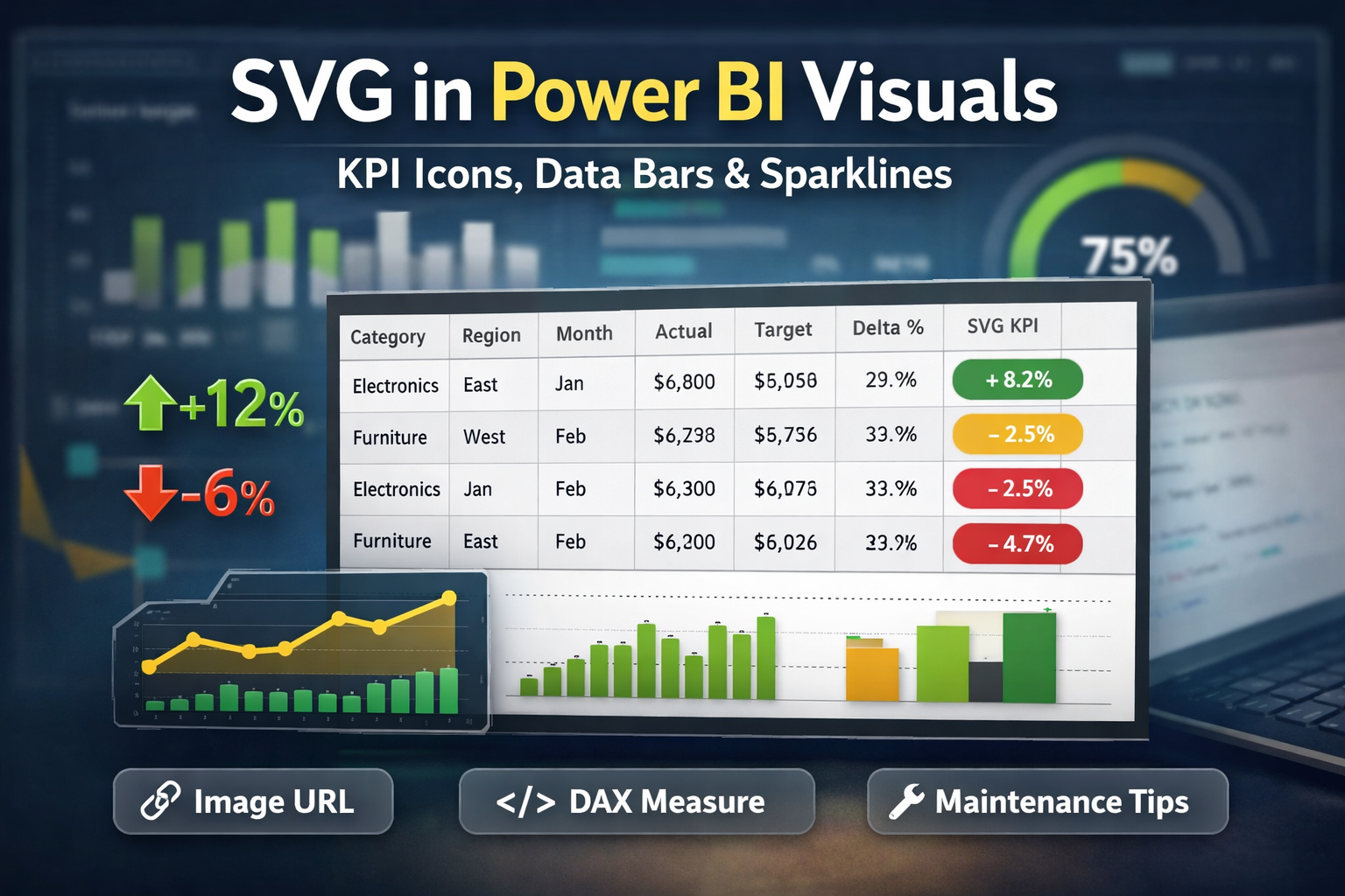
SVG measures are among the cleanest ways to add “micro visuals” (bars, KPIs, icons, sparklines) directly within tables, matrices, and certain card scenarios—without custom visuals. The trick is: you’re not really drawing in Power BI; you’re returning an image URL that contains SVG markup. This post shows a basic, production-ready setup, along with a maintenance approach so you don’t end up with 20 slightly different SVG measures nobody wants to touch.
Check out some of our FREE templates and materials.
PRACTICE MATERIAL BELOW!👇
1. When SVG in Power BI Makes Sense
Great Use Cases
KPI arrows (up/down/flat) in a table or matrix.
“Data bars” with full design control (rounded corners, labels, gradients).
Sparklines inside a table row (tiny trend chart).
Status pills (green/amber/red) that match your brand.
Potential Pitfalls
Performance: SVG measures are text-heavy. Hundreds of rows with complex SVG can slow down visuals.
Visual Support Varies: Tables and matrices are the safest bet; other visuals depend on feature support and settings. Microsoft’s guidance for dynamic images focuses on tables, matrices, slicers, and multi-row cards.
Mobile Limitations: Power BI mobile apps have restrictions for dynamic images.
2. The Basic Pattern: What You’re Actually Building
An SVG measure typically returns something like:
`data:image/svg+xml;utf8,<svg ...>...</svg>` (human-readable, but needs careful encoding)
or
`data:image/svg+xml;base64,...` (heavier, but avoids many encoding issues).
Then, you set the measure’s Data category to Image URL, and Power BI renders it as an image.
3. Demo Dataset: Download
Use this small dataset for practice (12 months × category × region, with target vs actual):
Download Power BI demo file: powerbi-svg-demo-data.
Dataset Columns:
Date, Month, Year, Category, Region
Target_KEUR, Actual_KEUR, Delta_KEUR
4. Step-by-Step: Build a KPI SVG Indicator (Basic Example)
Step 1 — Load the CSV
Open Power BI Desktop.
Click on Get data → Text/CSV → select the file.
Set data types:
Date = Date
Target_KEUR / Actual_KEUR / Delta_KEUR = Decimal number.
Step 2 — Create Measures
Create these DAX measures.
Step 3 — Create the SVG Measure
This example draws a small rounded “pill” with a colored dot and percentage text.
Step 4 — Tell Power BI It’s an Image
Click the KPI SVG measure in the Fields pane.
Go to Measure tools → Data category → Image URL.
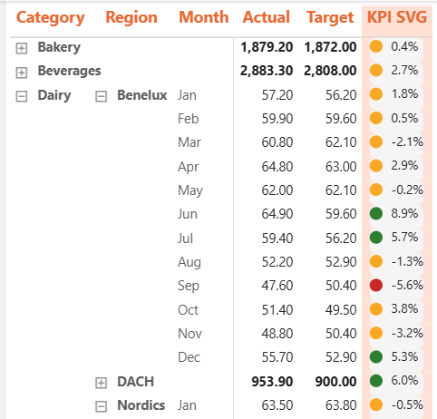
Step 5 — Insert into a Table/Matrix
Add a Table visual.
Include fields:
Category, Region, Month.
Actual, Target, Delta %, KPI SVG.
Resize the “KPI SVG” column to fit the pill.
💡 Pro Tip: Turn off text wrapping and reduce row padding for a clean “indicator column” look.
5. What to Consider: Avoiding Future Issues
Encoding Pitfalls
If your SVG contains spaces, #, %, quotes, or non-ASCII characters, your utf8 string can break.
Safer Options:
Replace # with %23 in color hex codes.
Avoid double quotes inside SVG (use single quotes consistently).
If you keep getting broken images, switch to base64 (more reliable, more verbose).
Experiment and adjust this part due to width/height.
(If you see a “broken image” icon in the table, it’s usually due to encoding or invalid SVG markup.)
Visual Support: Why Tables Are the Default Choice
Tables and matrices are the most stable places for SVG measures. Microsoft’s dynamic-image guidance focuses on these visuals (plus slicers and multi-row cards). Some newer or alternative visuals can be inconsistent across versions (community threads regularly mention regressions).
Performance Rules of Thumb
Keep SVG small (tight width/height).
Avoid complex paths for large row counts.
Prefer one SVG measure reused everywhere (see maintenance pattern below).
6. Maintenance Strategy: Avoid “SVG Spaghetti”
Here’s a simple way to keep SVGs maintainable.
One Reusable “Style” Measure + One “Render” Measure
Create a tiny set of helper measures you can reuse. Then your SVG measure just “renders”:
✅ Result: when branding changes (colors/fonts), you update one place.
7. Wrap-Up
SVG measures are a lightweight way to add custom visuals—especially for KPI indicators within tables and matrices. The key to sanity is standardising: one renderer measure, helper measures for style, and templates if you scale.
This is what comes at the very end. You can do unlimited things here.
If you found this guide useful, explore the related posts below or download a free Power Query cheat sheet by subscribing to the Excelized newsletter.

👉 Want to build this yourself, live? Book a 1:1 Power BI Crash Course and learn it hands-on with me.